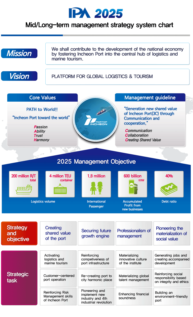
IPA’s Vision & Strategy
- Mission: We contribute to the growth of national economy by continually developing Incheon Port as a hub of logistics and maritime tourism.
- Vision : Platform for Global Logistics & Tourism
- Managerial Goals
- Logistics Volume : 200,000,000 R/T
- Maritime Tourists : 3.5 million
- Share of the New Growth-Leading Industries : 25%
- Debt Ratio : 40.7%
- Strategic Goals
- Creating port values
- Strategic Objectives
- Strengthen marketing efforts to increase the demand for the port
- Realizing customized port services
- Enhancing the added value of the supportive complex
- Strategic Objectives
- Enhancing competitiveness of the port infrastructure
- Strategic Objectives
- Developing port infrastructure in a timely manner
- Making Incheon Port a safe and eco-friendly port
- Optimizing the use of infrastructure
- Strategic Objectives
- Securing the driving force of growth for future
- Strategic Objectives
- Creating added value through passenger-centered business
- Recreating a city-friendly port space
- Ongoing investment and expansion of port technology R&D
- Strategic Objectives
- Strengthening a socially responsible business model
- Strategic Objectives
- Establishing a business strategy driven system of organization and personnel
- Enhancing financial soundness
- Secure the trust of the people
- Strategic Objectives
- Creating port values
- Core Values
- Dedication
- Development
- Diversification
- Discipline
Symbol Mark

- Morphological Characteristics
The letters "I" and "P" of Incheon Port are artistically expressed to convey the corporate brand image of a progressive and enterprising international port, and to represent the future values that Incheon Port is creating continually.
- The Significance of the Colors
The Blue-Purple shade connotes the marine environment and symbolizes the expertise and reliability of the Incheon Port Authority. The Blue-Green shade, which is also suggestive of the environment, symbolizes easy green growth and future values. These two symbolic shades of blue represent the essential values and principles that guide Incheon Port.


Slogan

"The First Port to Success" is the brand slogan conveying Incheon Port's preparedness to become the first port that will bring success and prosperity for everyone in the world. This slogan imprints the ultimate goal of Incheon Port in customers' minds by effortlessly delivering the brand's core values and the main vision in a language consumers can readily understand.
Signature (Basic)
It is important for a signature to accurately convey what the image is trying to express, and to ensure an independent space in order to increase the visual recognition. Therefore, it must be clearly differentiated with other visual elements.
At the time of use, the items or elements should be maintained in their original state in order to prevent the deformation.
Signature

Signature (Korean)
The slogan signature should be used to create and convey the internal and external image of Incheon Port CI. The slogan typeface should be limitedly used separately or in combination.

Signature (English)
Signature (Chinese)

Character

The motif of the water dragon is perfectly suited to the sea and water environment and visually connotes East Asian features and geographical territories. The character of the dragon presents Incheon Port Authority’s active and vigorous persona along with its vision of a great future. The bold and confident expression on the mascot displays the pride of Incheon Port as the core port of North East Asia.